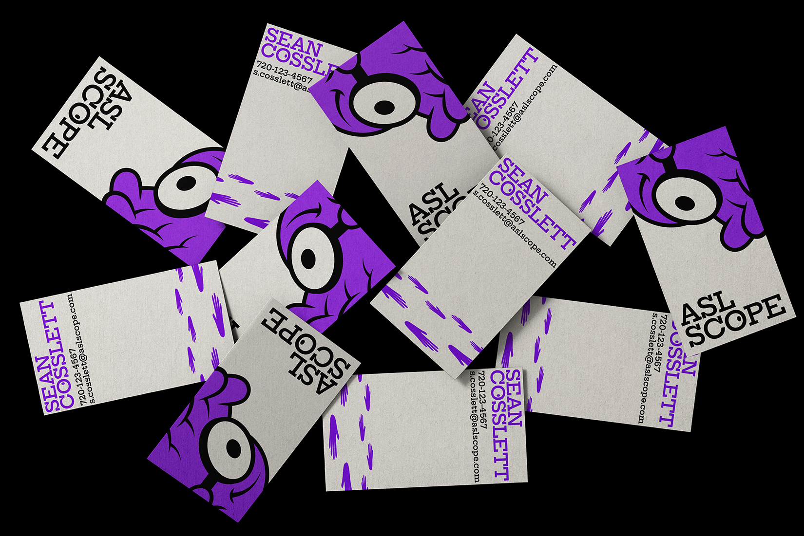
ASL Scope is a Deaf-owned brand focused on making ASL learning accessible and engaging. They needed a visual identity that felt educational, energetic, and rooted in Deaf culture. I created a clean, expressive logo inspired by hand movement and clarity in communication, paired with a bright, friendly color palette and approachable typography. The full identity system is designed to be flexible across platforms, helping ASL Scope connect with both Deaf and hearing audiences and grow their digital presence with confidence and authenticity.
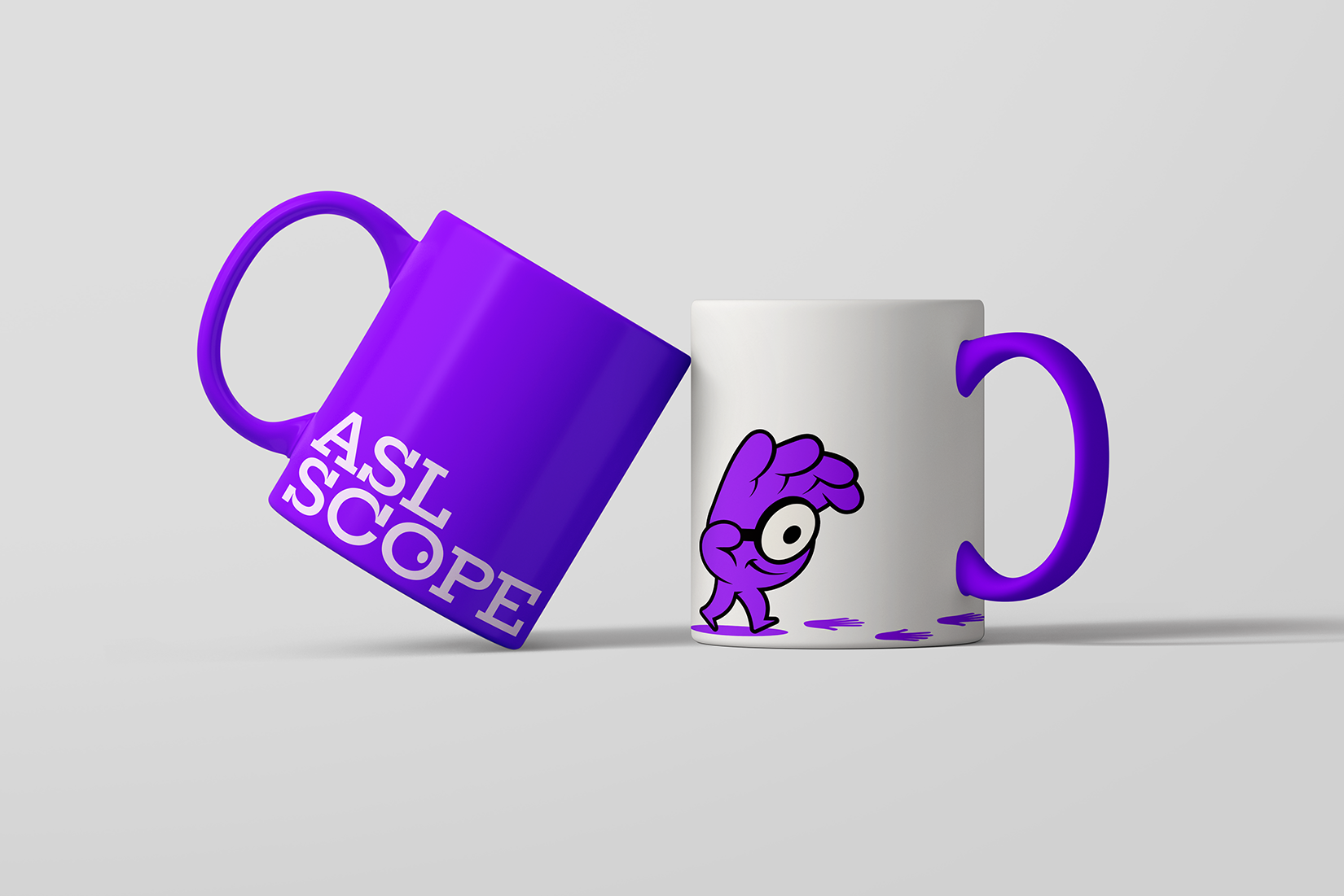
ASL Scope needed a logo that highlights American Sign Language in a way that feels fresh, intentional, and culturally respectful. While many designs rely on generic hand signs, this project leaned into American Sign Language hands with purpose, aiming to create something that connects directly to the Deaf community. The challenge was designing a symbol that feels bold and modern, while still honoring the depth and visual language of American Sign Language.
.png)
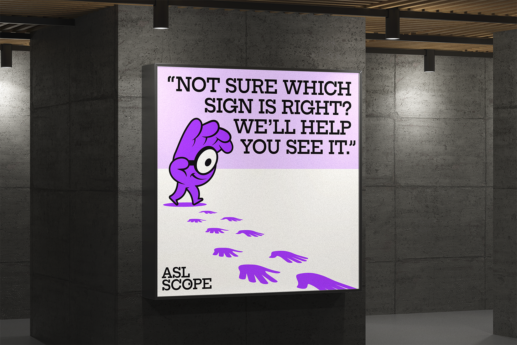
I struggled at first with how to turn an ASL hand into something more than just a symbol. I didn’t want it to feel generic. So I went on a walk, signing to myself and thinking out loud with my hands. That’s when I noticed something: the shape of the hand while signing looked like it could connect to the idea of magnifying or focusing in, which ties perfectly into the word "Scope." That moment gave me the idea to transform the hand into a brand mascot, something that could carry movement and meaning. After the walk, I went straight back and started sketching from memory, building off what I imagined and felt during that walk.
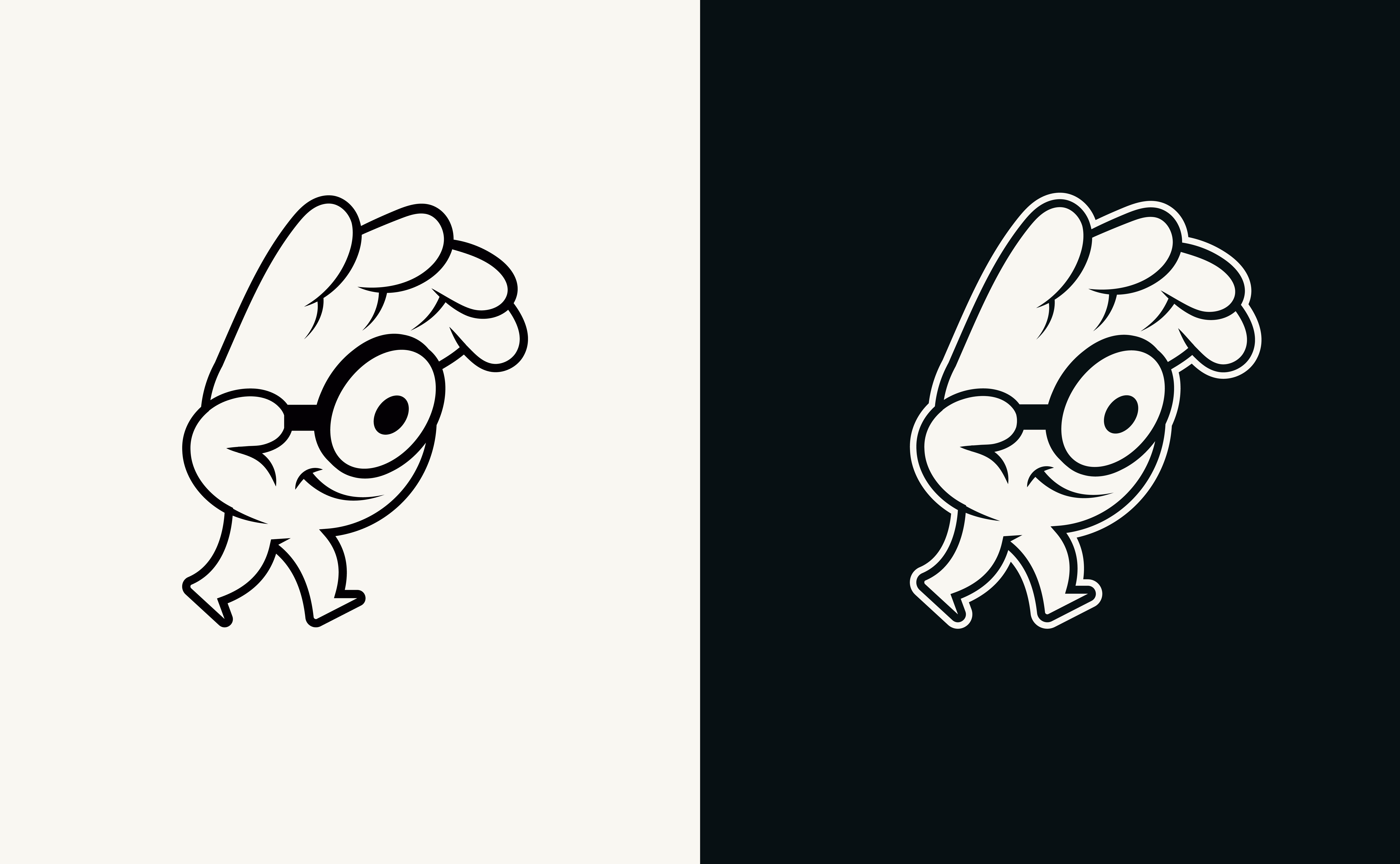
The final logo takes inspiration from the ASL “A” handshape, blended with the concept of a magnifying lens. It’s simple but expressive, a hand that feels alive, intentional, and tied directly to the name ASL Scope. It represents the idea of helping the right people find the right signs, with clarity and focus.
My client loved the direction. The logo captures both the purpose and the personality of the brand, making ASL visible in a way that feels bold, helpful, and rooted in Deaf experience.
"Before Caleb, I was on a quest to find a logo that truly embodied my vision, personality, and Deaf identity. I knew I needed to collaborate with a Deaf artist to bring my vision to life. Working with Caleb was a breezy ride experience. He effortlessly demystified and simplified the design process, ensuring that my feedback was heard and incorporated into the logo. When I saw the final results, I was astounded by how my vision, personality, and identity had been seamlessly blended into a creation. I was confident that the logo aligned perfectly with my business’s mission of providing services to the interpreting and ASL communities. I wholeheartedly recommend Caleb to anyone seeking a logo designer. His talent and expertise are truly remarkable, and I am incredibly grateful to have him as my business logo designer."
Pendley Painting is a woman-owned business delivering clean, honest, and high-quality paintwork with a personal touch for homes and small spaces.
.png)
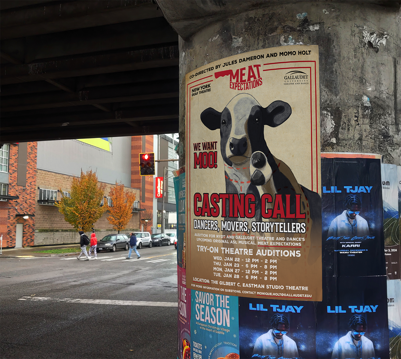
Meat Expectation needed a logo and audition flyer styled like a butcher shop. I brought their raw, theatrical concept to life with bold, meat-market visuals.