Pendley Painting is a woman owned business built on hard work, quality, and trust. My wife started the company with a mission to provide professional painting services with a personal touch. She needed a brand identity that felt professional, clean, and approachable, something that would help her stand out and build credibility in a competitive market. I created a visual system that reflects her attention to detail and passion for the craft. This case study shares the journey from concept to final design, highlighting how we brought her vision to life.
Pendley Painting began with a clear goal: build a clean, professional brand that feels personal and trustworthy. My wife originally planned to offer pet painting services, but her focus shifted to residential and commercial projects. With the new direction, she had no existing brand elements and needed help building everything from scratch.
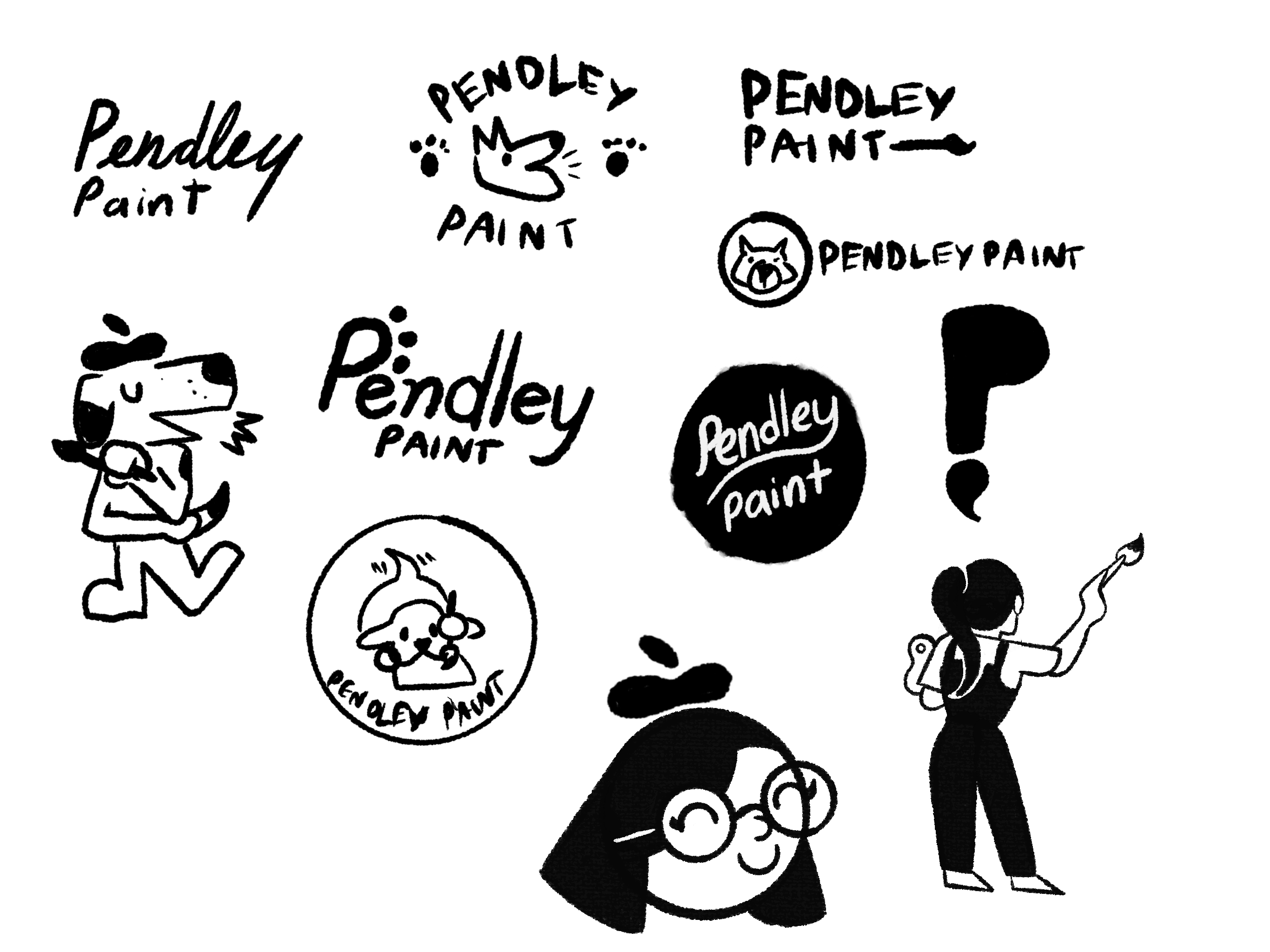
One key goal was to develop a strong brand "signature" and something that felt like her own mark. The challenge was creating a bold, simple identity that reflected her style, while capturing the essence of painting in a memorable and personal way.
I started this project by sketching concepts for a pet painting brand, since that was the original plan. But halfway through, she shifted her focus to residential and commercial painting which completely changed the direction of the brand.
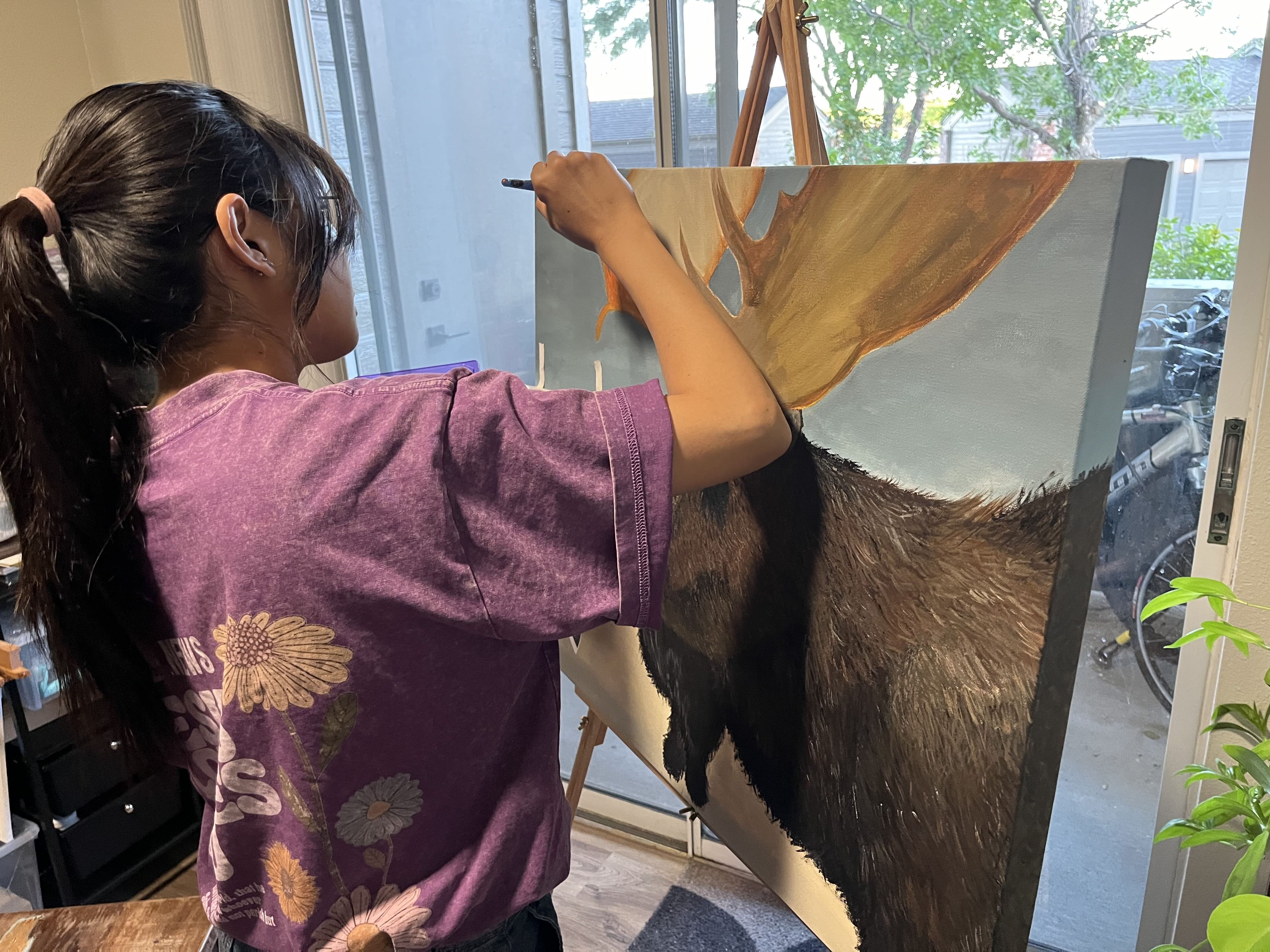
Instead of scrapping everything, I leaned into what made her work unique. I kept thinking about how I always stand behind her, watching her paint and that moment stuck with me. It inspired me to create a logo that captures her in action: a portrait of her back while painting. It felt honest, personal, and different from any other painting business I’d seen.
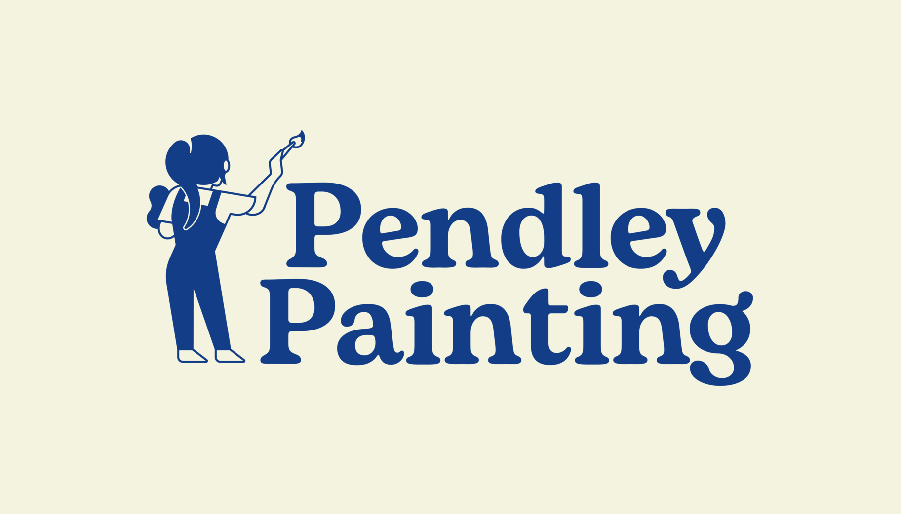
The final logo captures everything we wanted, it feels clean, artistic, and personal. By using a silhouette of my wife from behind as she paints, the brand tells a quiet story: this is a business built by someone who genuinely loves the craft.
I’m proud of how the logo turned out, not just because it looks great, but because it means something. It’s more than a design, it’s a reflection of her journey and her personality. She loved it right away, and seeing her reaction made the process even more rewarding.
The rest of the brand system builds on that same energy, beautiful colors, clean type, and subtle artistic touches that help Pendley Painting stand out in a meaningful way.

.png)
"The brand fits my personality! I love how the style matches my vision for my small business. It is truly inspired me! I'm literally part of the logo! I'm so impressed by his design skills, colors selection! I loved working with him! Of course, he's my husband and I love everything about him and his work!"
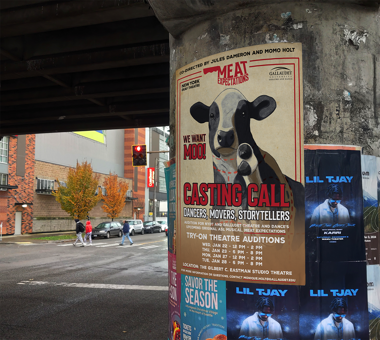
Meat Expectation needed a logo and audition flyer styled like a butcher shop. I brought their raw, theatrical concept to life with bold, meat-market visuals.
ASL Scope is a Deaf-owned brand making ASL learning accessible and engaging through bold, inclusive design that reflects clarity, movement, and culture.